

Juliana Bicycles Redesign
Visual Design | BRAND & PRODUCT DESIGN
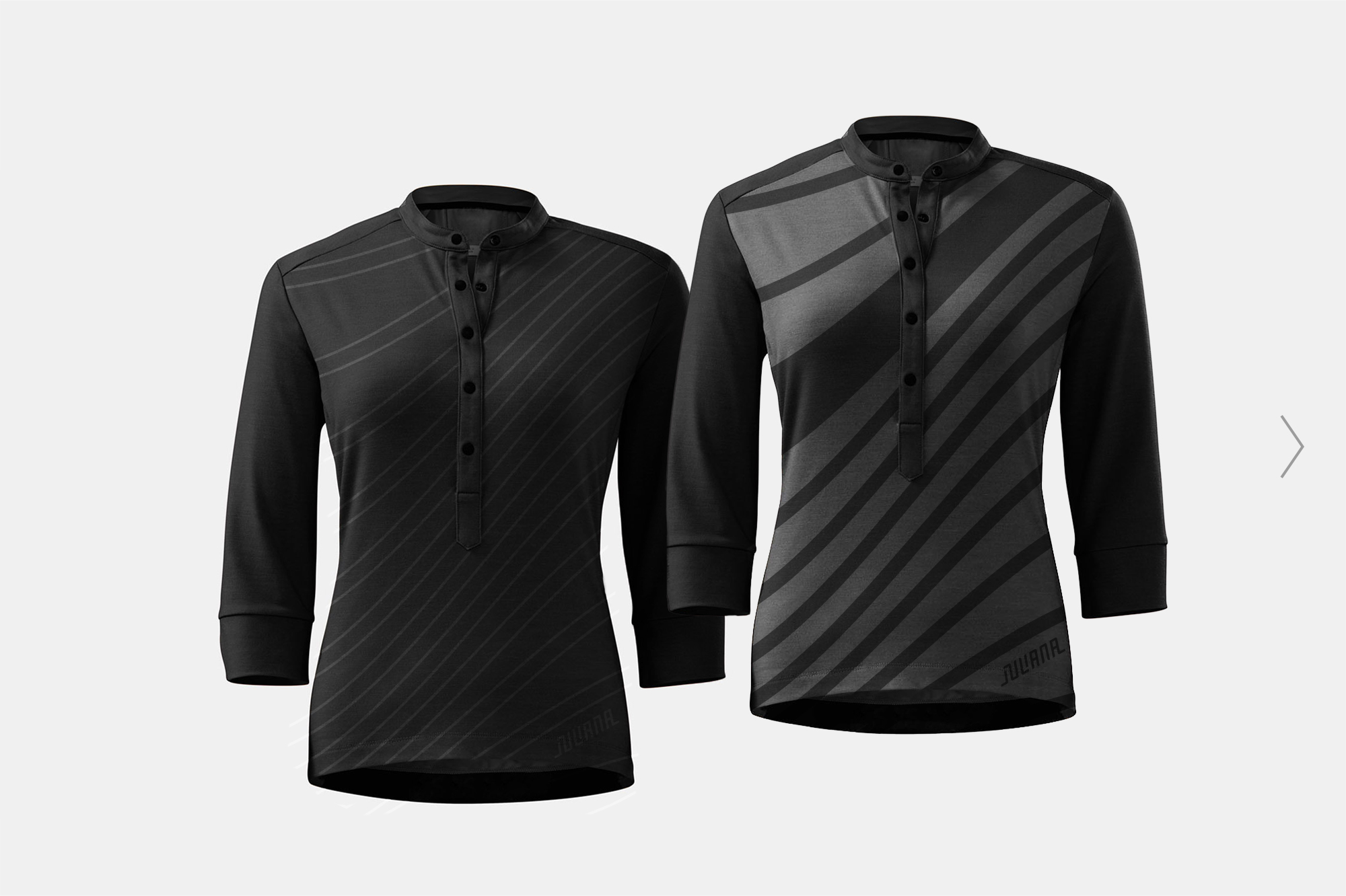
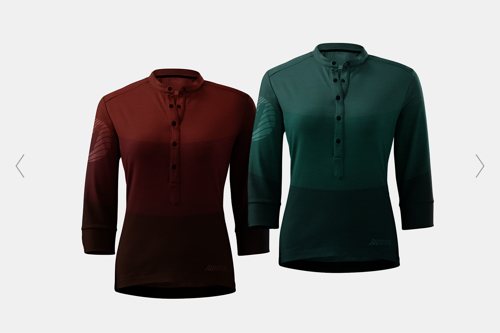
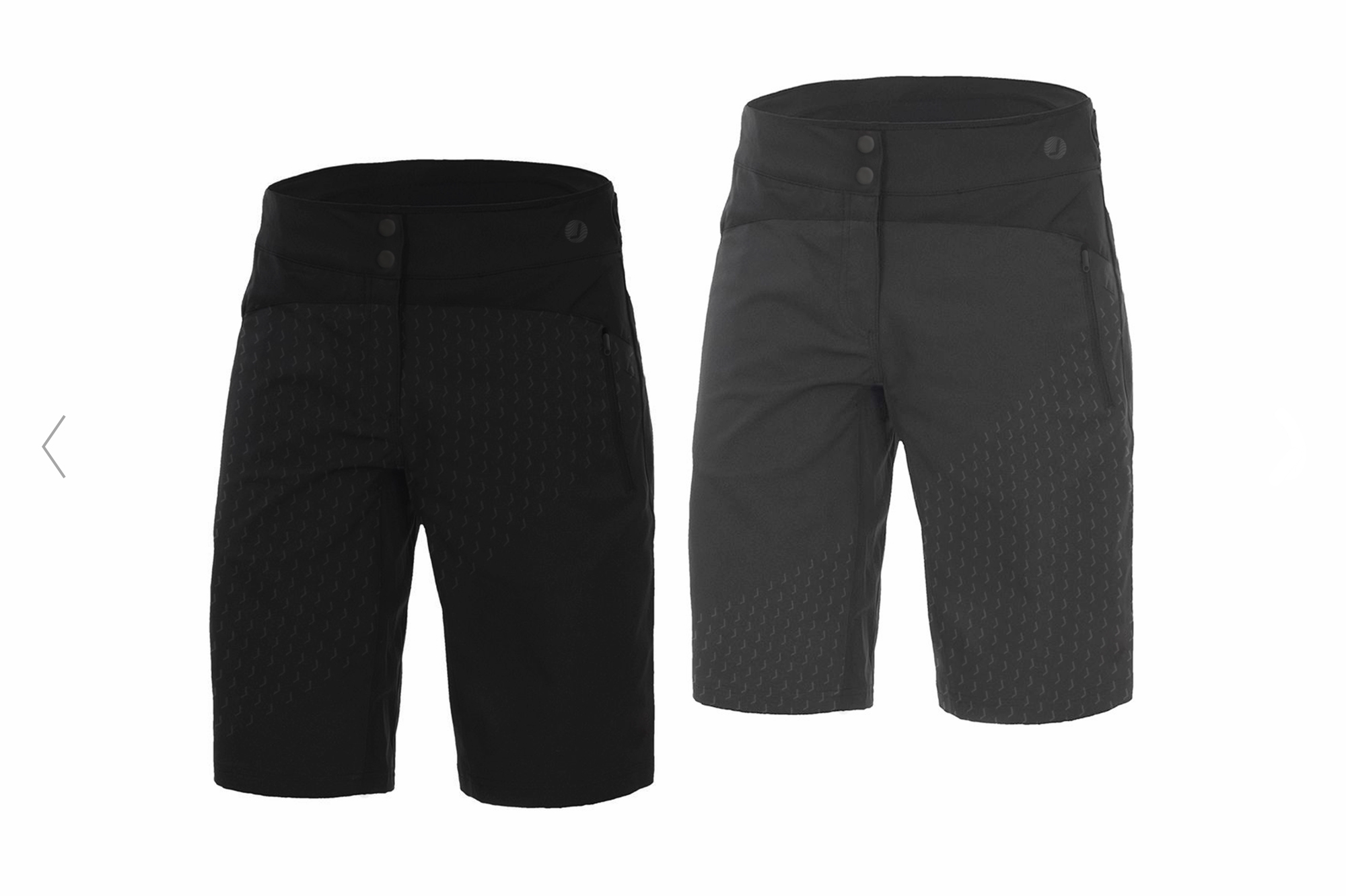
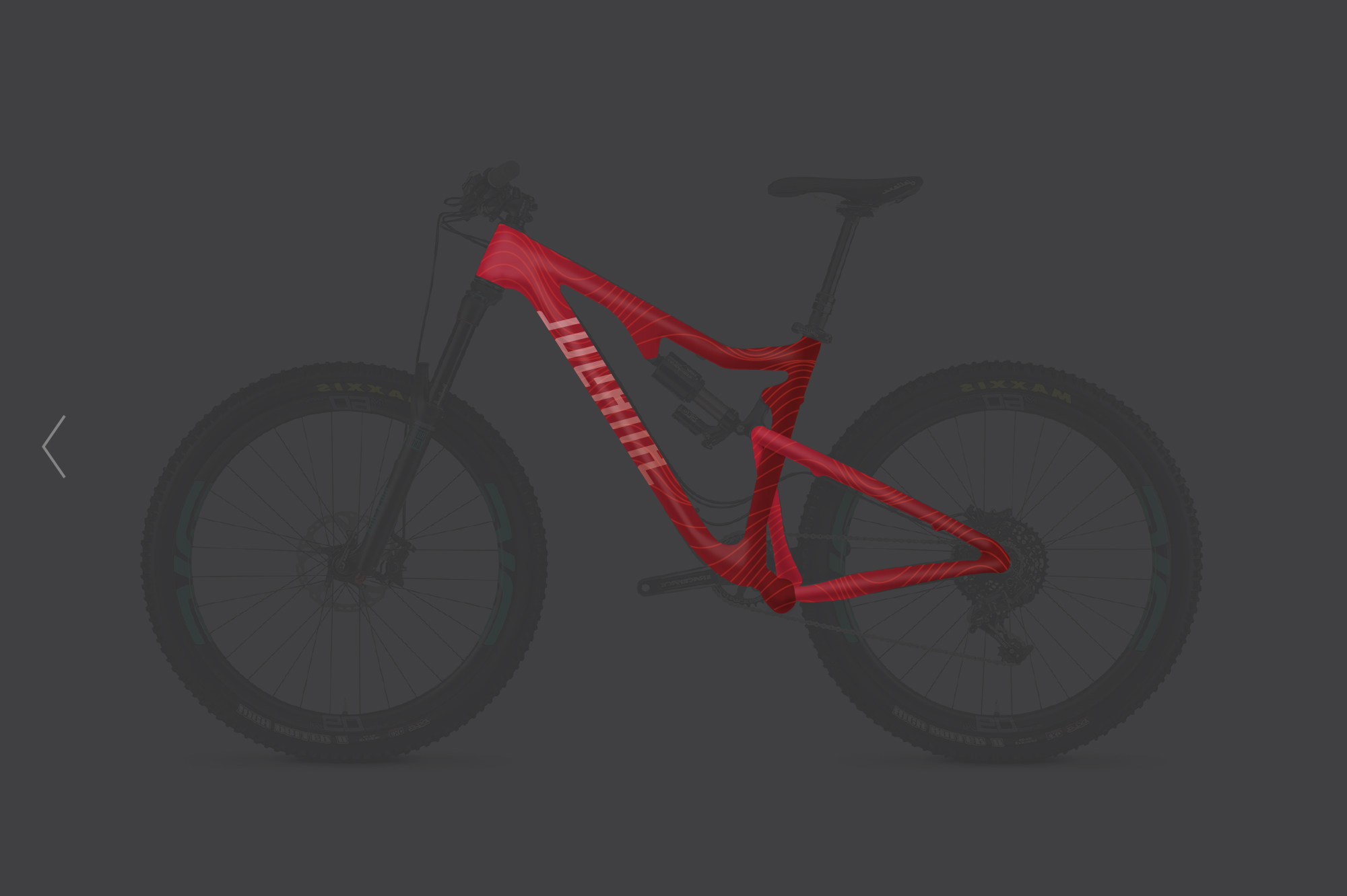
This is a redesign of the women's division of Santa Cruz Bicycles. In the bike industry, Juliana deserves strong branding to hold its own in a mostly masculine playing field. As a company with history, the goal was to have Juliana stands tall next to its sibling company.
IDEATION & PROCESS
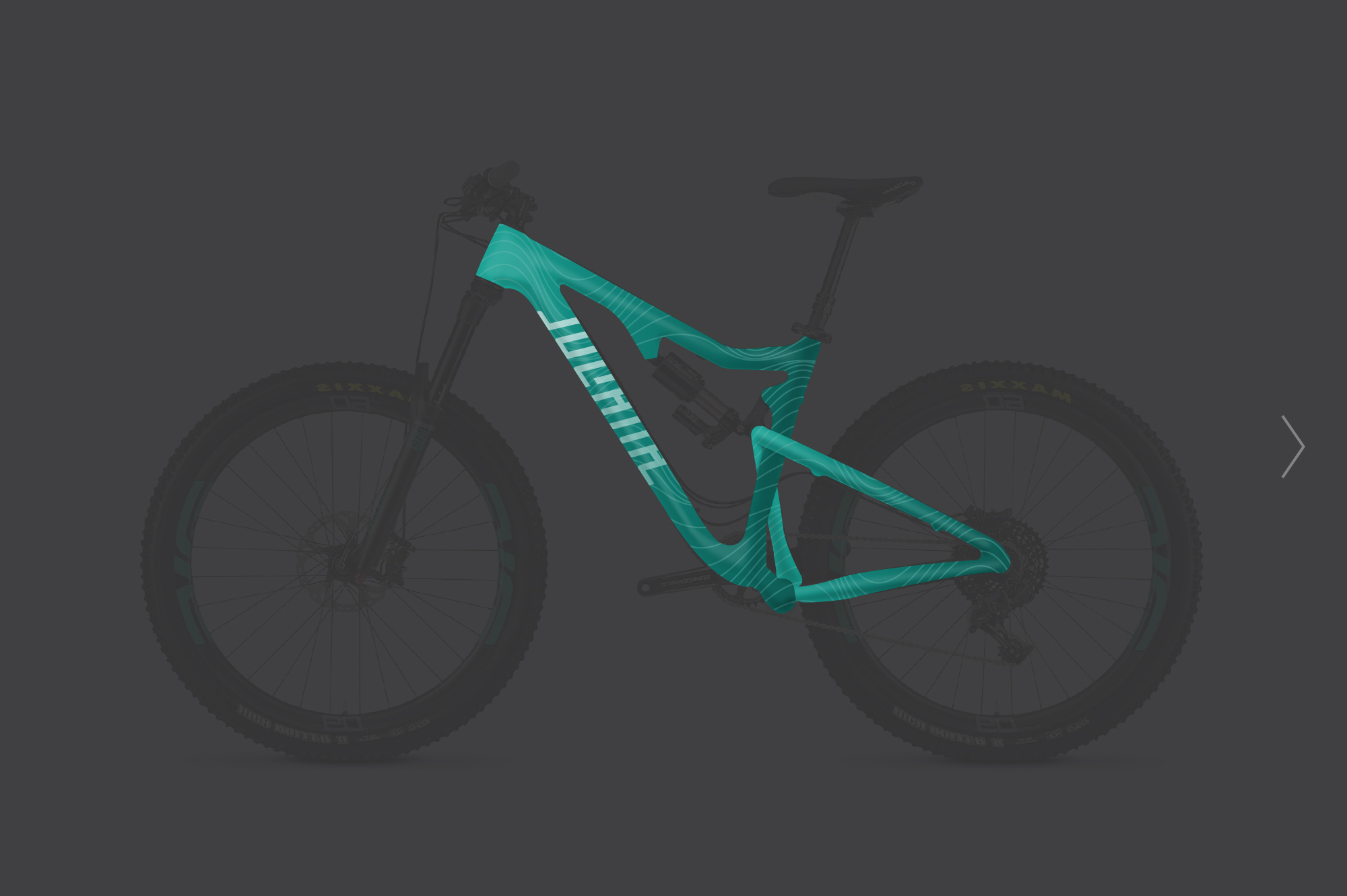
Aiming to express structured geometry seen in the frames of the bikes, I worked to tesselate the Juliana logo in various ways. This was to indicate rolling motion and give movement to the brand. While I did reference the current branding, moving away from cursive script brought the brand into the present.
Below are some ideas I explored.
